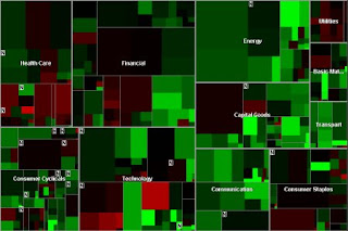
This visualization shows stock market information and its fluctuations over time. The area of rectangles represents the market cap of a stock, and the color shows the year to date change with red representing negative change, and green showing positive. The different stocks are grouped together by sector, so the map is an easy way to quickly analyze how the market is doing overall.
No comments:
Post a Comment