Absolutely NUTSSSSSS
Friday 17 September 2010
Sunday 22 November 2009
Arduino - Flash connection
Ok everyone, so here are some screencapture tutorials on how to connect Arduino to Flash. For the sake of simplicity, I set all the examples up to be reading 4 buttons. For now I will only be showing you how to have arduino as an input to flash and not the bi-directional communication between the 2. Its very possible, but I would focus on getting 1 way traffic to work before making it more complex.
I'm sure that there will be questions, but I only ask that you post the questions here rather than email so that everyone can benefit from the answer and I don't have to repeat myself.
Here's the overall setup of how it works:
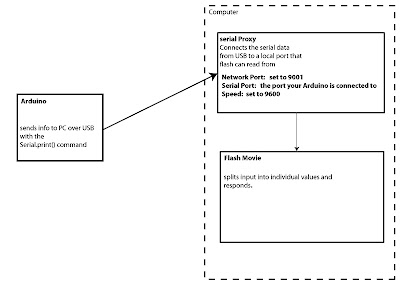 -The code in Arduino sends the data over USB by using the Serial.print() command
-The Serial Proxy Program receives the data from the USB port and connects it to an internal port that flash can read.
-The information is then unpackaged and applied in Flash.
Step 1- download the files HERE
Important Notes on the Arduino Code:
-baudRate that it is communicating at: In our case 9600
-the order that you are collecting the button info in
The Serial Proxy must be running BEFORE the flash file
Network Port: 9001
Serial Port: Find out from Arduino on mac it will be the usbserial-XXX one
Speed: 9600
Input all these settings BEFORE you hit Start
if it works it will say:
Listening on port 9001…
opened com port usbserial-XXXXX
Flash example 1
This example is a basic test, once splitting the incoming values into our Array called input. we can then apply it.
such that
input[0] = button1value
input[1] = button2value
input[2] = button3value
input[3] = button4value
the if statements are constantly updating so when it receives a buttons value as 1 it moves the movieclip to pixel 350 and when it receives 0 it moves it to pixel 36.
the way you can do that is by giving each movieclip an instance name:
I called them button_1,button_2,button_3,button_4
and the syntax to move them in x is button_1._x = ?
the value is the pixel value on the screen.
Flash example 2.
This example expands the complexity slightly to use the buttons as a trigger. The way it does that is by storing the previous value so we can have an animation play only on the time when it switches, Otherwise it would keep starting the animation an not let it finish.
This same example could really easily be changed to play audio or load another movieClip. You would just change the code after the If Statements.
Tuesday 22 September 2009
Wake Up And Smell The Color

EVen if the results of your early-morning culinary endeavors appear bland and beige, all is not lost. With the right accessories, even the humblest breakfast can look cheery and stylish.
To attempt the task of making muffins, you’d get a head start by using the non-slip, nesting set of measuring tools and bowls called, fittingly, Nest, and designed for josephjoseph.com by London-based Bill Holing and Ben Cox, known together as Morph.
Mystical Fire

Remember when you threw newspapers and magazines into the fire and the flames turned green, blue or red – and it was really cool? Well, this amazing powder is designed to do just that! Based on the coloured chemicals that fireworks use, this ( non explosive) powder turns a boring old fire into a amazing array of colours! It’s a unique way to enjoy a brilliant display of colourful flames on a wood burning fire.
Media Plaza - Utrecht Netherlands

123dv Architectuur & Consult is yet another award-winning – and strangely numbered – multi-disciplinary Dutch design firm. The Rotterdam-based 123dv practices architecture and interior design in a wide range of areas from residential to commercial buildings, from small-scale to huge projects.
Light and projection are the main features also in the foyer and in the meeting rooms. To create different moods or to emphasize event-appropriate colors, the LED-light walls in the foyer and the fabric ceilings in the session rooms can change color.

Artist: Andy Gilmore An


Take a look at these incredible abstract and retroesque pieces by designer and illustrator Andy Gilmore Born, raised and based in Rochester, New York, Gilmore applies the understanding of one practice with the other - applying the proportions of harmony to form and colour - colours as chords - and scales as tonal gradations, in order to create these geometric works of art.
3D LED Lighting

The Swiss Federal Institute of Technology merges the concepts of lighting and art with this spectacular 3D LED piece, dubbed NOVA. Created for the institute's 150th anniversary, the display is made up of 25000 lightballs.
Incredibly it can display 16 million colours per second. The behemoth, which weighs 3.3 tonnes, is currently displayed at the Zurich train stations main hall, where it will live until September 2009.

Brain Scanner

A decoding system unveiled this week in Nature by neuroscientists from the University of California at Berkeley. The scientists used a functional magnetic resonance imaging machine -- a real-time brain scanner -- to record the mental activity of a person looking at thousands of random pictures: people, animals, landscapes, objects, the stuff of everyday visual life. With those recordings the researchers built a computational model for predicting the mental patterns elicited by looking at any other photograph. When tested with neurological readouts generated by a different set of pictures, the decoder passed with flying colors, identifying the images seen with unprecedented accuracy.
LED Spray Paint
 Halo is an LED spraypaint can by French designer Aissa Logerot. Basically, instead of spraying paint, it has an LED that sprays light! The LED light can change colors and brightness on the fly and while it's powered by an internal battery that can be charged by shaking of the can. "Graffiti artists can conserve their own gesture they have with an aerosol spray. It is possible to change the color and the brightness of the led to change the graffiti's styles. If the light doesn't have enough battery, the user must shake it to have energy again."
Touch the Invisible Sky
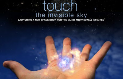
This is a book funded by NASA to develop a way to let people who cannot see - read what space looks like through their fingers. The book is filled with color images captured from telescopes. Each image is embossed with lines, bumps and texture that denote the the size shape and feel of things shown in the image.
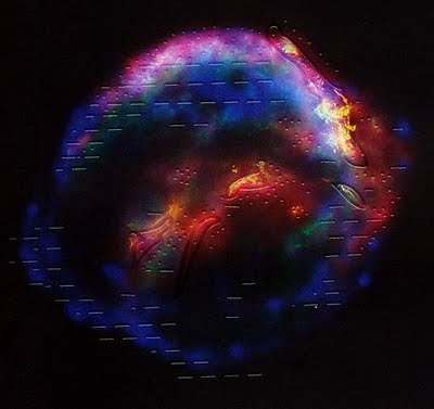
Even the colors are denoted in the textures on the picture... even though they may not be sure of the true empact of the color itself. The pages give them tactile variations in the surface that which allow a sense of what is created by those colors. Then after reading what causes those colors from the brail pages they can get a better understanding of outer space in a way the blind had no possiblity to understand before.
Radiology Art

Artist and medical student Satre Stuelke founded the Radiology Art project to explore the hidden contents and structures of everyday things. Dedicated to the deeper visualization of various objects that hold unique cultural importance in contemporary society, this project intends to plant a seed of scientific creativity in the minds of all those inclined to participate.

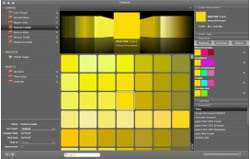
Color Finesse
Another nice tool that we "can't" afford ($600) is the Color Finesse Synthetic Aperture. This product is specifically geared towards photography and video color correction and adaptation. The great difference between this tool and the Color Munki is that Color Finesse draws strength from using gain, gamma, pedestal, hue and saturation to affect the color within the image.
Some of the options in this product are similar to programs like Photoshop. However, Color Finesse works with a '6-channel secondary color corrector' that allows you to select 6 seperate colors within the image and to manipulate their characteristics together. This allows for a more atmospheric difference between the two programs.

Some of the options in this product are similar to programs like Photoshop. However, Color Finesse works with a '6-channel secondary color corrector' that allows you to select 6 seperate colors within the image and to manipulate their characteristics together. This allows for a more atmospheric difference between the two programs.
Color Munki
Color Munki is a spectrophotometer geared to read a physical object for color and then design an entire palette of over 50 colors that are similar based on imput data (i.e. complimentary, color, hue, saturation, etc...) Once you have these palette they can easily be imported into creative software for use, without the hassle of having to select each entry one-by-one.
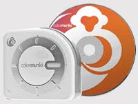
...the software for the tool is similar to i-tunes.
The sad part about this tool is it's price: $499 ... that's rather expensive for those who are not working professionally.
Machine Vision
The two videos below show how robots deal with pattern recognition and color recognition. In the first video we can see that robots can discern between colors and recognize the presence of multiple objects. The second video shows pattern recognition. Pattern recognition must first be programed in order to recognize an object.
Computer Vision
This is a quick video example of very simple computer vision. A certain color has a programmed response in which the computer follows with a box.
www.EMGRobotics.com
www.EMGRobotics.com
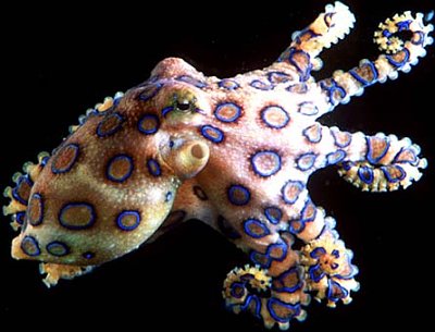
How do squid and octopuses change color?
A number of cephalopods--the group of animals that includes octopuses, squid and cuttlefish--are skilled in the art of color change, which can be used for camouflage or to startle and warn potential predators in their undersea realm. Many of these creatures have special pigment cells called chromatophores in their skin. By controlling the size of the cells they can vary their color and even create changing patterns. Chromatophores are connected to the nervous system, and their size is determined by muscular contractions. The cephalopods also have extremely well developed eyes, which are believed to detect both the color and intensity of light. Using their excellent eyesight and chromatophores, cephalopods camouflage themselves by creating color patterns that closely match the underlying seafloor. In squid, color changes also occur when the animal is disturbed or feels threatened.
http://www.youtube.com/watch?v=DNXwXo3t3Cw
Map of the Market

This visualization shows stock market information and its fluctuations over time. The area of rectangles represents the market cap of a stock, and the color shows the year to date change with red representing negative change, and green showing positive. The different stocks are grouped together by sector, so the map is an easy way to quickly analyze how the market is doing overall.
Color Symbolism in Buddhism
Color symbolism is used in a wide variety of fascinating ways in Buddhist art and ritual. In Buddhism, especially in Tibetan Buddhism, each of five colors (pancha-varna) symbolizes a state of mind, a celestial buddha, a part of the body, a part of the mantra word Hum, or a natural element. (Blue and black are sometimes interchangeable.)
ollowing is a table summarizing the meaning of the main color symbols in Buddhism. Click on the color name for a full article and examples of that color. (This article on general color symbolism continues below.)
 |  |  |  |  |  | |
| Color | ||||||
| General Meanings | coolness, infinity, ascension, purity, healing | primordial darkness, hate | learning, knowledge, purity, longevity | life force, preservation, the sacred, blood, fire | balance, harmony, vigor, youth, action | rootedness, renunciation, earth |
| Seen In: | turquoise, lapis lazuli | black thangkas | White Tara, white elephant | coral, red thangkas | Green Tara | saffron robes of monks |
| Emotion, Action | killing, anger | killing, hatred | rest and thinking | subjugation and summoning | exorcism | restraining and nourishing |
| Transforms: | anger into mirror-like wisdom | hate into compassion | delusion of ignorance into wisdom of reality | delusion of attachment into the wisdom of discernment | jealousy into the wisdom of accomplishment | pride into wisdom of sameness |
| Buddha | Akshobhya | n/a | Vairocana | Amitabha | Amoghasiddhi | Ratna-sambhava |
Part of Hum | the dot (drop) on the crescent | n/a | the crescent | syllable 'ha' | vowel 'u' | the head |
| Body Part | ears | n/a | eyes | tongue | head | nose |
| Element | air | air | water | fire | n/a | earth |
What is “Deep Color” and why is Deep Color so important?
Basically, deep color expands the colors on the display from millions to billions. This gives a vividness and color accuracy which has not been seen before in display technology. Deep Color defines colors by using an algorithm that can specify any color in that is found in nature. Deep Color gets rid of the on-screen color banding, for tonal transitions that are smooth and graduations of color that are very subtle. It enables increased contrast ratio, and can represent many times more shades of gray between black and white. Deep color with a color bit depth of 24 bit is normally called true color. However, some people use true color interchangeably with deep color.
What deep colors actually means is that there are more colors. With a color bit depth of 30 bit the number of available colors becomes one billion. If the color bit depth is changed to 36 bit, the number of available colors jumps significantly to sixty nine billion colors. If the color bit depth is changed, this time to 48 bit, the available colors will number 2800 times one trillion. This is an enormous amount of colors. Plus a higher bit resolution can display more shades of gray. With 30 bit color depth four times more gray can be represented. Eight times more gray, or even higher, can be represented by a 36 or 48 color bit depth.
Researchers have estimated that the amount of colors seen by the human eyes number in the tens of thousands. But, depending on the lighting conditions and any surrounding colors, a human eye can tell the difference between millions of differing shades, an example is that you’ll be able to distinguish many more shades of black in darkness than you can see in brightness, so the additional shades will show a noticeable difference, but it is uncertain when the number stretching stops becoming useful to the human eye.
Researchers have estimated that the amount of colors seen by the human eyes number in the tens of thousands. But, depending on the lighting conditions and any surrounding colors, a human eye can tell the difference between millions of differing shades, an example is that you’ll be able to distinguish many more shades of black in darkness than you can see in brightness, so the additional shades will show a noticeable difference, but it is uncertain when the number stretching stops becoming useful to the human eye.
Muta (2005)
Gatteo a Mare, IT - Competition
Gatteo a Mare, IT - Competition

MUTA, designed for the valorization of the external image of OIKOS headquarters (firm of solvent-free paint systems), proposes a truly experimental approach to the question of color in architecture. Interpreting the tradition of accurate studies about color and attention towards the environment, the project aims to produce a visible manifesto of the company’s philosophy and a step in the direction of the research. MUTA integrates nature and artificial as collaborating parts of a whole dynamic system. A decise landscape intervention amplify and marks the seasonal colour shift, developing crucial bio-climatic functions at the same time. A new pervasive network of distribution of colour climbs up the building facades and sprinkle them, drawing from the production plant.

Color Models
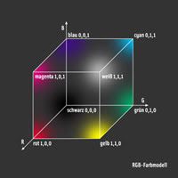
RGB Model
RGB stands for the three additive primary colors red, green and blue. Thru additive color mixing, all colors of the RGB-Model can be produced. Monitors and televisions use the RGB-Model to show colors. Each primary color has a value between 0 and 1. R=G=B=1 equals white, R=G=B=0 equals black.
All RGB colors can be shown in a cube. The three primary colors, the three secondary colors (cyan, magenta, yellow) as well as white and black are positioned in the corners of the RGB-cube.
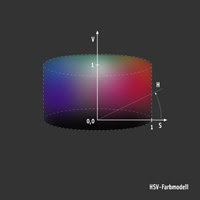
HSV Model
Downside of the RGB model is the difficulty to mix colors. It is not easy to find the right amount of red, green and blue to mix a specific color tone. Mixing colors using the HSV model (hue, saturation, value) is much more intuitive because there is a separate value for the hue.
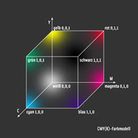
CMY(K) Model
Displaying colors on a screen is based on the RGB model (additive), whereas printing colors on paper is based on the subtractive CMY(K) model. CMY(K) stands for cyan, magenta, yellow and black. Similar to the RGB model, all CMY model can be displayed in a cube.
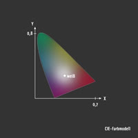
CIE Model
The CIE model was defined by the "Commision International de l'Eclairage" in 1931. The three additive primary colors red green and blue are replaced by the standardized primary colors X,Y,Z. The XYZ color space comprises all visible colors. XYZ are virtual colors that are used to display all visible colors with positive algebraic signs. The spectral consistence correlates to the color perception of the human eye: The value of XYZ is proportional to the physical energy of the represented color.
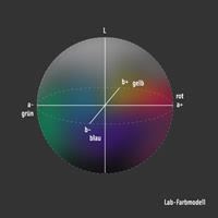
CIE L*a*b Model
The CIE L*a*b model is a common color space, redefined from the original CIE model in 1976. It is based on the human perception of color which is based on the three color receptors of the human eye (red, green, blue). L is the value for the luminance of an object (L = 0 = black, L = 100 = white). The chrominance is defined by the a and b values. The a value stands for red (a is positive) or green (a is negative). The b value stands for yellow (b is positive) or blue (b is negative). The higher the a and b values, the more saturated the color.
YIQ Model
YIQ is used in color TV broadcasting. It is downward compatible with black and white television where only Y is used. Y stands for the luminance (intensity). I and Q determine the chromaticity. I is the red-orange axis, where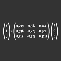 as Q is roughly orthogonal to I.
RGB stands for the three additive primary colors red, green and blue. Thru additive color mixing, all colors of the RGB-Model can be produced. Monitors and televisions use the RGB-Model to show colors. Each primary color has a value between 0 and 1. R=G=B=1 equals white, R=G=B=0 equals black.
All RGB colors can be shown in a cube. The three primary colors, the three secondary colors (cyan, magenta, yellow) as well as white and black are positioned in the corners of the RGB-cube.
HSV Model
Downside of the RGB model is the difficulty to mix colors. It is not easy to find the right amount of red, green and blue to mix a specific color tone. Mixing colors using the HSV model (hue, saturation, value) is much more intuitive because there is a separate value for the hue.
CMY(K) Model
Displaying colors on a screen is based on the RGB model (additive), whereas printing colors on paper is based on the subtractive CMY(K) model. CMY(K) stands for cyan, magenta, yellow and black. Similar to the RGB model, all CMY model can be displayed in a cube.
CIE Model
The CIE model was defined by the "Commision International de l'Eclairage" in 1931. The three additive primary colors red green and blue are replaced by the standardized primary colors X,Y,Z. The XYZ color space comprises all visible colors. XYZ are virtual colors that are used to display all visible colors with positive algebraic signs. The spectral consistence correlates to the color perception of the human eye: The value of XYZ is proportional to the physical energy of the represented color.
CIE L*a*b Model
The CIE L*a*b model is a common color space, redefined from the original CIE model in 1976. It is based on the human perception of color which is based on the three color receptors of the human eye (red, green, blue). L is the value for the luminance of an object (L = 0 = black, L = 100 = white). The chrominance is defined by the a and b values. The a value stands for red (a is positive) or green (a is negative). The b value stands for yellow (b is positive) or blue (b is negative). The higher the a and b values, the more saturated the color.
YIQ Model
YIQ is used in color TV broadcasting. It is downward compatible with black and white television where only Y is used. Y stands for the luminance (intensity). I and Q determine the chromaticity. I is the red-orange axis, where
as Q is roughly orthogonal to I.
Sentence Graphs

These are bar diagrams that show the sentence structure from speeches delivered by Obama and McCain at each of their conventions. There is a bar for each sentence in the order they were said in text, and the words are colored according to the topic they correspond to. The most frequently used words are also shown for each region of the text. Of course, government related topics dominate both sides in the beginning. Yet, Obama dedicated almost the entire speech discussing domestic and economic issues, with a small section on security. McCain however, focused primarily on security issues. The two diagrams also indicate used more sentences then Obama, yet Obama's sentences were longer. The average sentence length for McCain was 78 characters, while Obama averaged around 115 characters per sentence, almost 48% greater. All in all the study showed that the basic gist for the republicans were 'Life is dangerous - and we will fight to protect you', while the democrats were saying 'Your everyday life is hard - and we will help you make it better'.
IntermodulationVisualizer
I haven't been able to find much on this, but from what I can gather, this artist comosed a series of sound waves to which colors react. The program is called Intermodulation Visualizer (or IM Visualizer) but I can't find anything else about it.
Color Maturity Levels
This was an interesting look at marketing in Hollywood. The study looked at the top grossing movies under each of the content rating blocks and what colors were used in thier advertising/marketing images. There is a direct correlation between the target age of a film and the colors used. The older the target audience, less colors are used and they are typically darker. The younger the target audience, the more colors are used, and the colors are typically more vibrant.


Meeting Today
Hi everyone,
sorry for the late notice, but we will be meeting today @ 4:30 in room 414A in the Center for Manufacturing. Just go to the 4th floor and you'll see the sign for the 414 suite. Once you go in its the 1st door on your left.
See you then.
Nick
sorry for the late notice, but we will be meeting today @ 4:30 in room 414A in the Center for Manufacturing. Just go to the 4th floor and you'll see the sign for the 414 suite. Once you go in its the 1st door on your left.
See you then.
Nick
Subscribe to:
Posts (Atom)