
Using a cartogram (right)the map distorts to take into account the population density as well. Now the acreage of the physical space is no longer valid and is replaced with population size.

 There is a new computer program which lets your brain turn a MRI machine into a musical instrument. The program assigns notes to an active region of the cortex.
 Sea surface temperatures give scientist information about ocean currents, climate, climate change, and how a hurricane may evolve. NASA has their own website that has frequent updates on the ocean temperatures. There are two primary types of sea surface temperature data thata NASA scientists use:
- actual temperature readings from the oceans surface.
- sea surface temperature anomaly.
The color graphics that are shown at the left are generated from data collected from the Advanced Microwave Scanning Radiometer (AMSR-E). This data is plays a vital role for climatologist to monitor and forecast hurricanes. And to forecast the frequency and intensity of hurricanes in all oceans.
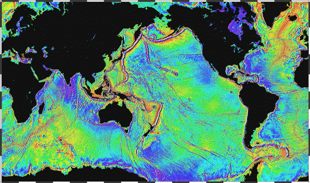

 A colormap is an m-by-3 matrix of real numbers between 0.0 and 1.0. Each row is an RGB vector that defines one color. The kth row of the colormap defines the kth color, where map(k,:) = [r(k) g(k) b(k)]) specifies the intensity of red, green, and blue.
colormap(map) sets the colormap to the matrix map. If any values in map are outside the interval [0 1], you receive the error Colormap must have values in [0,1].
colormap('default') sets the current colormap to the default colormap.
cmap = colormap retrieves the current colormap. The values returned are in the interval [0 1].
colormap(ax,...) uses the figure corresponding to axes ax instead of the current figure.
Essentially, colormap uses colors to map z-axis information - if the x and y-axes are assumed to be in their traditional orientation. The image above is a fuel map utilizing the "jet" colormap. What I find interesting is the use of color to show information in two dimensions that actually represents three dimensions in real-world testing. Colormap is interesting in its flexibility and breadth of data-set representations.
